Good to see you
Welcome to Dulux Trade
Terms and Conditions
Thanks! for registering
Successfully registered, please login
Registration complete
Forgotten your password?
Please enter email address associated to your account
Change Password
Password changed successfully.
Request sent!
Would you spare a minute to answer 3 questions
Registration complete
Successfully registered, please login
Delete Account
Healthcare colour and contrast: a guide to best practice
Colour is an important part of the built environment and this applies as much to healthcare as any other sector.
Healthcare colour schemes need to take into account all the users of the building, from the patients and their families, to the people who work there. It needs to consider the purpose of the rooms, and the opinions of all stakeholders who are involved. There is no formula for creating a great healthcare colour scheme, and it is therefore down to the designers' expertise to choose a colour scheme that is best for the particular healthcare environment.
The Importance of Colour, Lighting and Visual Contrast
The design and provisions of colour, lighting and visual contrast are important issues for all users of environments, but especially so for people with a visual impairment. It is estimated there are one million people in the UK who are either registered blind or partially sighted or who have serious visual impairment. Add to this the general effects on sight of the natural aging process or exacerbated by dementia and an even larger proportion of the population are impacted.
Around 82% of visually impaired people still have sufficient residual vision to discern colour to some extent; and the research has established that while visually impaired people are generally less confident than the fully sighted at differentiating colours, if the colour difference is above a certain threshold value their confidence improves significantly. It is not the actual colour of a feature that is important but more the difference in colour between the feature or surface and those that adjoin it; and, of course, the appropriateness of the lighting.
When linked with the understanding of how a visually impaired person might assess and use an environment and where they actually look when doing so, it is possible to use visual contrast to improve the environment for visually impaired people without compromising on colour schemes or designs.

Buildings regulation part M 2013: 3.12
In order to help people with visual impairment to appreciate the size of a space they have entered, or to find their way around, there should be a visual contrast between the wall and the ceiling, and between the wall and the floor.
It is important to emphasise that in meeting the requirements of Part M, the guidance offered is not prescriptive. It is one potential way of meeting the requirements of the Equality Act as this is not about buildings but about people.
And there may be times when it is not practical to adhere strictly to the guidelines. For example, to have a 30-point LRV (Light Reflectance Value) difference between wall and ceiling might require a wall colour that is too close to doors or a floor surface which cannot be changed immediately; in this case it may be necessary to highlight door frames with larger LRV difference or reduce the contrast between the ceiling and the wall.
What are Critical Surfaces and why are they important?
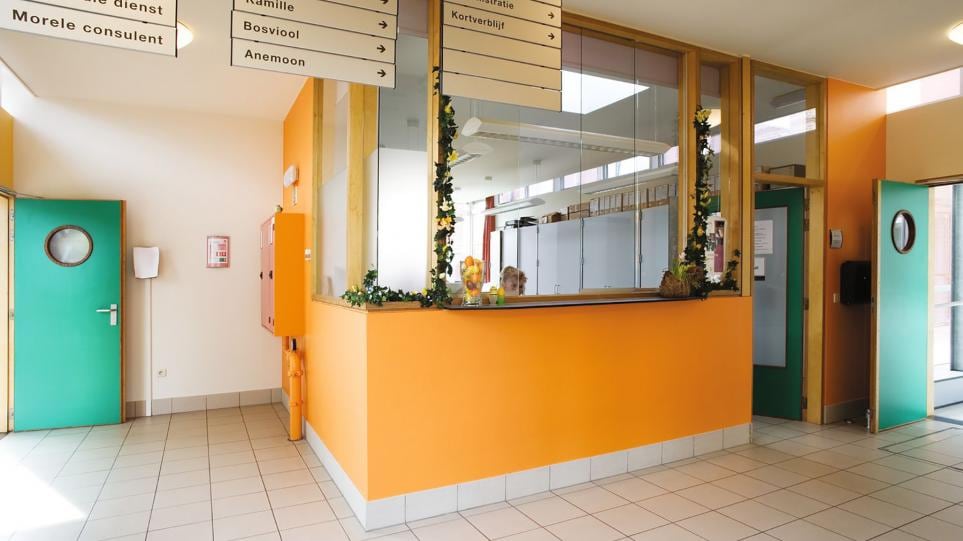
Critical surfaces are the most important features for gathering information and understanding a space in terms its dimensions as well as identifying entrances and exits. They are: walls, doors, floor and ceiling.

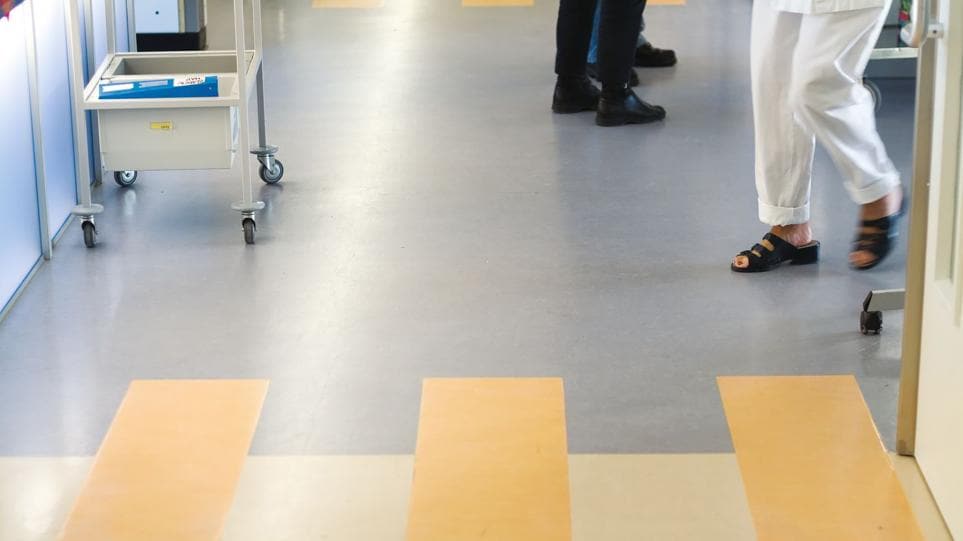
Critical surfaces are an essential way that people with reduced vision gather a sense of their surrounding especially the size and shape of an area. It is most important that the contrasts between floors and walls are within the guidelines as this tends to be the two areas that are predominantly used to scan for visual contrast. People with this kind of difficulty will constantly look/scan for visual contrast as they move throughout an area so making this as clear as possible is an important part of the designer's job. The wall is also the surface that is adjacent to all other critical surfaces.
Colour scheming strategy
- The ceiling colour is to be sufficiently different from the wall colour
- The wall colour is to be sufficiently different from the ceiling colour and the floor colour
- The door colour is to be sufficiently different from the wall colour
- The stair colour is to be sufficiently different from the adjoining wall colour

About the Dulux Trade Colour Palette
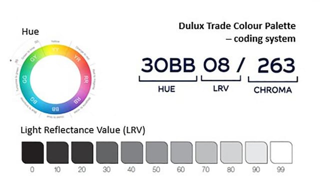
The Dulux Trade Colour Palette has a unique coding system which is made up of three segments each reflecting an element of how we see colour: hue, light reflectance value and chroma.
Hue is the colour family; within each hue there is a scale from 00-99. For example, 30BB.
Light Reflectance Value (LRV) is the lightness or darkness of the colour, and also the essential measure when following the requirements of the Equality act part M. LRV is shown on a scale of 1-99: where the number relates to the % of light reflected from a surface.
Chroma is the intensity of a colour. The final three digits represent the amount of colour saturation intensity, s measure on a theoretical scale of 000-999. A higher number will be strong or deep shades and paler or greyer colours will have a lower chroma value.
Add a new job
Add a new job
Edit job
Delete job
Are you sure? All notes, photos and saved items will be deleted.
Save Color
Save to My Workspace
Add to job
Save to My Workspace